Playing the game
Vrints-Kolsteren
The work of Belgian graphic design studio Vrints-Kolsteren—whether joyous or subdued, artful or a frame full of art—is a hybrid of the rational and artistic: a process of experimentation in search of ground rules. Partners Naomi Kolsteren and Vincent Vrints describe it as a game. By playing the game, they establish its rules, allowing them to play again and again with a fresh outcome each time. It is precisely the creation of the rules that allows them to play with such freedom.
“Dutch design influenced both of us a lot,” says Kolsteren, who is seated beside Vrints in front of a wall teeming with books, a constant and reliable source of inspiration for both. “The Dutch design in a more structured way; Belgian design has fewer rules. Dutch design starts from a grid or some kind of structure; in Belgium, there’s a rich history of art that has influenced graphic design, so it’s more free and artistic looking. Our work is a combination of the two.”
“We work in a systematic way,” Vrints adds, “but it looks experimental.”
Born in Patan, Nepal and Antwerp, Belgium, respectively, Kolsteren and Vrints were both raised in Antwerp and met while studying illustration and discovering graphic design at St. Lucas School of the Arts. After graduating with honors in 2012, Vrints went on to work for Dutch graphic design office, Studio Dumbar, and Kolsteren to Belgian agency Mirror Mirror. Within three years, however, the two had launched Vrints-Kolsteren to do creative direction, photography and graphic design for brands in more creative and cultural fields. “Working at big studios, you miss the connection with clients,” Vrints says. “When we work with people now, it’s more of a collaboration. The client has ideas, we have ideas, and we mix them up. It’s more of a conversation.”
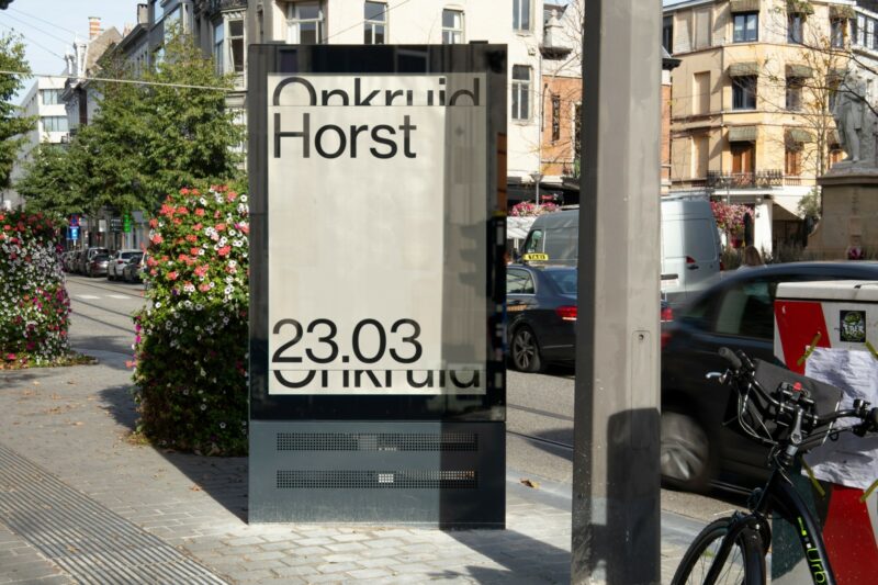
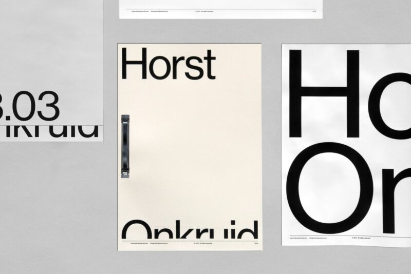
Today, with iF and Red Dot awards to their names, their work is remarkable for its pairing of color and type to create identity ecosystems that tend to balance the very expressive with the pointedly neutral. The studio’s use of black-and-white and a generic typeface for the identity of Onkruid, for example, has a powerful, purposeful neutrality. A creative events platform (music festivals, art interventions) run by an interdisciplinary team, Onkruid’s purpose is to foreground other creative brands. Its identity needed to privilege that of its partners. Instead of designing a logo, V-K created a system in which Neue Haas Grotesk becomes the protagonist of largely black-and-white billboards, among other items, on which Onkruid’s name frames and displays collaborator names or images. One series of billboards features a partner’s ‘poster’, in color, as if it has been wheat-pasted over a (black-and-white) poster advertising Onkruid, cutting off half its name. An eye-catching twist on graffiti: Onkruid has let itself be backgrounded by the partner it is promoting.
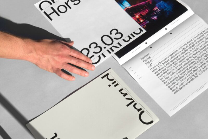
Onkruid conveys a powerful, purposeful neutrality.
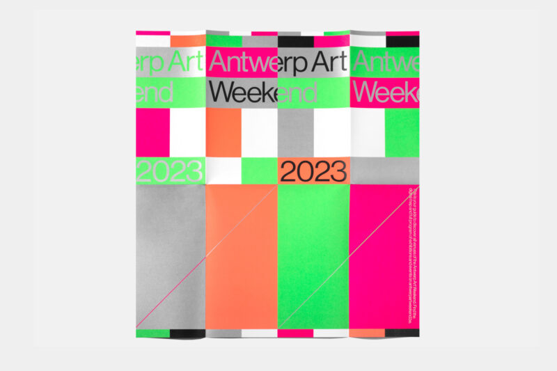
Today, however, “it’s hard for us to not use color,” Kolsteren admits. “And our approach to color is different. Often brands go for one color and try to claim it. But with identities, we usually opt for more than one.” Antwerp Art Weekend’s identity revolves around a different set of unorthodox color combinations each year. They sometimes burst onto the eye: This year, banners, billboards, signage and stationary sizzled with contiguous checkerboards of blue and yellow, fuchsia and orange, teal and rose, as if television broadcast system test screens had bred Cubist offspring. These still patterns thrum with energy while emphasizing subdued, simple, sans serif text with surprising clarity.
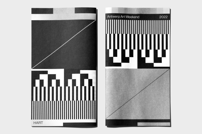
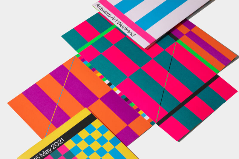
Antwerp Art Weekend’s identity revolves around a different set of unorthodox color combinations.
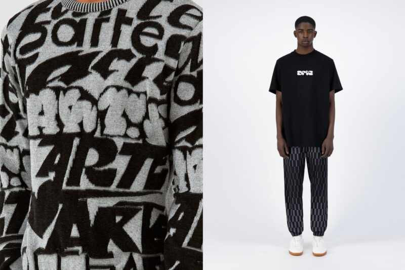
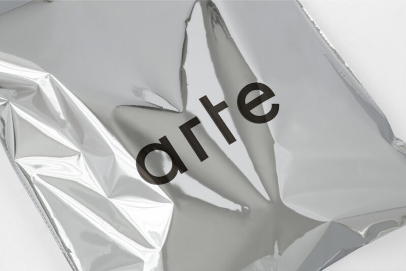
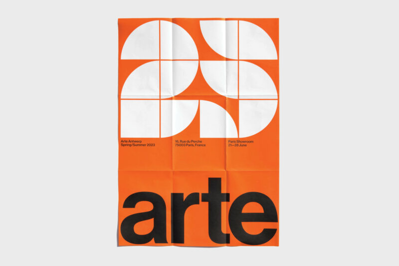
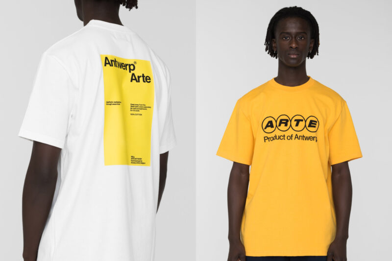
The studio’s use of type is similarly eloquent even when plainspoken. For menswear label Arte Antwerp, to focus attention on the fashion, for everything except for the bespoke logo, they used a minimalist, off-the-shelf typeface, Century Gothic Monospace. For the diverse, experimental and DIY Academy of Visual Arts in Mol, where Vrints teaches graphic design, “we wanted the type to speak,” he says, “so we created it for ourselves.” The result, an old sans serif type drawn on a grid, looks as if it should push the bounds of legibility, but actually reads well in a variety of contexts and scales.
To focus attention on the fashion, Arte Antwerp uses a minimalist, off-the-shelf typeface.
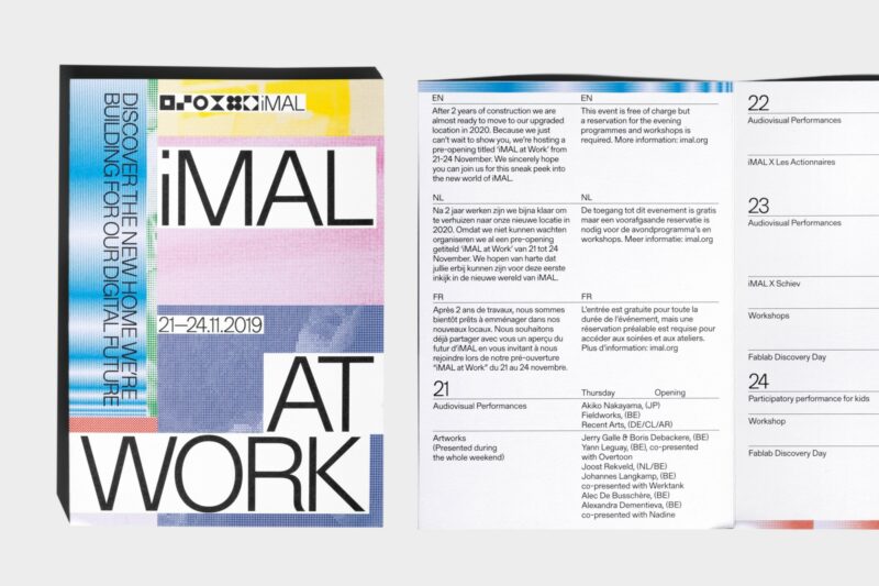
For iMal, a technology-oriented arts center, V-K created an identity that looks dynamic even on the printed page. They assigned each department a color code and symbol—a dot, line or icon—that becomes a pixel to be stretched, shrunk or distorted, concentrated or dispersed, a building block that, en masse, generates larger moving images.
“Just making a logo doesn’t work anymore,” says Vrints. “It works better to have a flexible, versatile system instead of one static image. Our best identities are the ones that we keep on evolving, a game that needs to be played again and again.”
More: Vrints-Kolsteren.com
Story: Shonquis Moreno
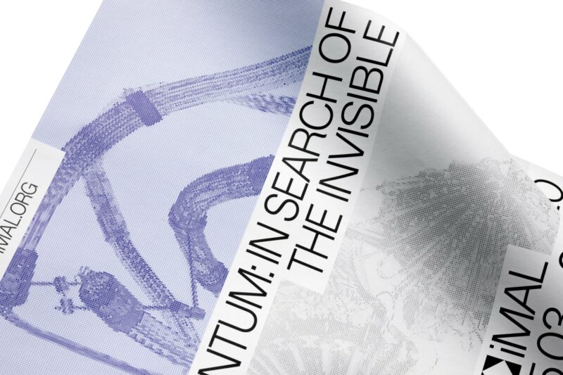
iMal leverages a flexible, versatile system.
Q + A
Is there another Belgian designer or artist who influenced your work? Why is this creative important to you and which projects would you recommend people look at by this person?
Naomi: Rene Magritte is one of our favourite artists, a Belgian surrealist who became well-known for creating a number of witty and thought-provoking images. Often depicting ordinary objects in an unusual context, his work is known for challenging observers’ preconditioned perceptions of reality. He uses a lot of typography in his work in an original way.
Vincent: Paul van Ostaijen was a Belgian poet and writer. He was influenced by Dadaism and Expressionism. We love him for his visual poetry/concrete poetry. He expressed the words in the poems by means of rhythmic typography.
Which was your favorite childhood visual design or object and why did you love it so much?
Naomi: I really loved Lego or Duplo. I always used to build the houses and sets, but not play with the figures [in them] afterward. I think I just loved building a world they could live in.
Is there anything different and inspiring about the studio you work in or the home you live in together? What is it? Why is it there? Did you put it there?
We often do projects with artists. They are friends or sometimes acquaintances, so sometimes we work in exchange for a piece of art instead of payment. That has allowed us to collect some art pieces in our house. Knowing the artists personally gives them an extra value for us, a story to look back on later.
Do either of you collect anything? If so, what? Why did you choose that particular type of object to collect?
We collect books, mostly second-hand books that we find in thrift stores. We know a few good shops in the Netherlands that we visit frequently. We are starting to have a nice collection of Wim Crouwel catalogues that he designed for ‘Het Stedelijk Museum’. They are amazing, especially the covers. But there are a lot of amazing books to find. We are also collecting a series by Dutch designer Jurriaan Schrofer.
We also like to buy ordinary household objects when we are abroad.
Do you each have a favorite book, either for literary/content or visual value, hopefully usually both? Which books and why?
Vincent: We love to collect books, but one of my favorites is My Way to Typography by Wolfgang Weingart. The book is printed beautifully and the content is amazing. His work is in between rigid Swiss style graphic design and illustrative, more autonomous, expressive work. It's a playful approach to graphic design.
Is there anything that you still prefer to do manually or in a traditional or old time-y way in your work?
When we do photo shoots we always build our sets, ourselves. Sometimes we have to get very crafty building a paper setup, for example. But it’s fun to do something different from time to time. We also hand-make signage for some projects, for example for Antwerp Art. We used big wooden panels and blocks that we spray-painted in the Antwerp Art colors. It’s very refreshing to turn away from the computer and turn graphic design into actual objects.
What is the most inspiring place in Antwerp, in your opinion, a place you go to relax or let inspiration in?
We love the Middelheim Park in Wilrijk. It’s an outdoor museum. The Middelheim Museum collection features approximately 1800 works of art. Works date from around 1900 to the present and provide an excellent international overview of modern and contemporary art.
In the museum/park, there is also a pavilion designed by Belgian architect Renaat Braem. We really appreciate his work.
Featured Surfaces
After working with the LiveSurface app, themselves, for years, Naomi and Vincent collaborated with LiveSurface to create a 20 image set.
“The first meeting with a client is really important,” says Kolsteren. “We listen to what they’re saying.” The two start brainstorming right away, sketching by hand and (mostly) in Illustrator. Working with LiveSurface, they usually present multiple proposals to the client and help them choose. LiveSurface has allowed them to cut down on the number of maquettes they create and to present the ones they do create at a later stage in the project, mostly to show the client the actual dimensions of, say, an artist’s book they’re designing. “Before LiveSurface we did the same thing, but in Photoshop, and it didn’t look so good,” Vrints admits. “This meant we had to do a lot more explaining to the client. LiveSurface makes it easier to show our ideas in a very direct way and helps show the clients what an idea could become.”


